
Why Cheerful Data?
How data can change the way you see the world.

Is the world getting worse?
I’m Rob, a 42 year old Dad from Cambridge, UK. Earlier this year, I found myself feeling increasingly down about the state of the world. Climate change, war, inequality, inflation, the pandemic…there’s plenty to be concerned about, and I spent a lot of time worrying about the world my children were growing up in.
After a conversation with my father about whether the world was getting better or worse, I started looking into the data behind it. And what I found amazed me, and gave me hope.
1. Many things are getting better
Check out this graph:
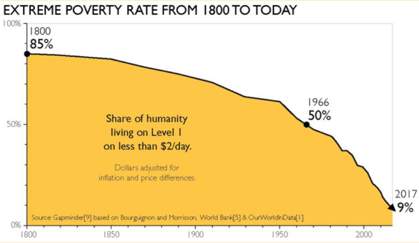
This is an insane success. The last 200 years are the only time in humanity’s history in which we have reduced the extreme poverty rate, and we have done it shockingly quickly. Of course, that 9% of humanity still living in extreme poverty should be a priority for all of us, but that doesn’t belittle the triumph that this graph shows. Think of all the suffering, death and misery that has been reduced because of the shape of that graph.
I created cheerful data to share and appreciate successes like this.
2. Avoiding the negativity trap
I recently came across a post on Reddit with many people talking about how they had no hope for humanity. It’s certainly possible to argue that this is a valid position, but does the data support it?
One thing that is certainly true is that we have a bias for negativity. Check out this graph:
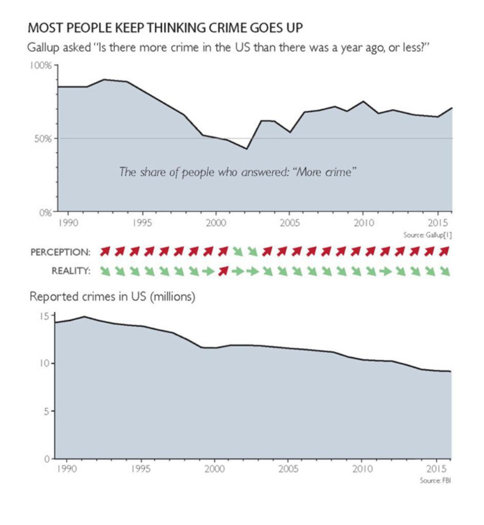
We are all attracted to negative news, which is why there is so much of it in social media and newspapers. But that often means that good news, such as a steadily decreasing crime rate, is often completely ignored.
3. Bad but better
In this stack I’ll be sharing charts and data that show the ways in which the world is improving. I’m primarily doing this for my own benefit, but if it gives others hope as well, all the better. This is not to deny that there are many bad things going on, but it is accepting the truth that many major aspects of our world are seeing improvements.
A final example: in 2020, 5.0 million babies died. This is clearly an awful thing, and we should do all we can to lower that number. However, in 1950, this number was 14.4 million, and this was with a world population of 2.5 billion, less than a third of what it is today. That’s a massive reduction of the mortality rate, and of all the suffering and pain that goes with it.
4. Factfulness
Those that have read Factfulness by Hans Rosling will have spotted that most of the examples above come from that book. If this post has resonated with you I highly recommend reading his book.
Most posts on this stack will be much shorter than this one - just a graph and a brief bit of explanatory text. My hope is that they will bring a small amount of positivity into our fractious online space, and encourage a realistic, factful and data-driven cheerfulness.