
Individual income around the world...
...has dramatically increased in the last 40 years

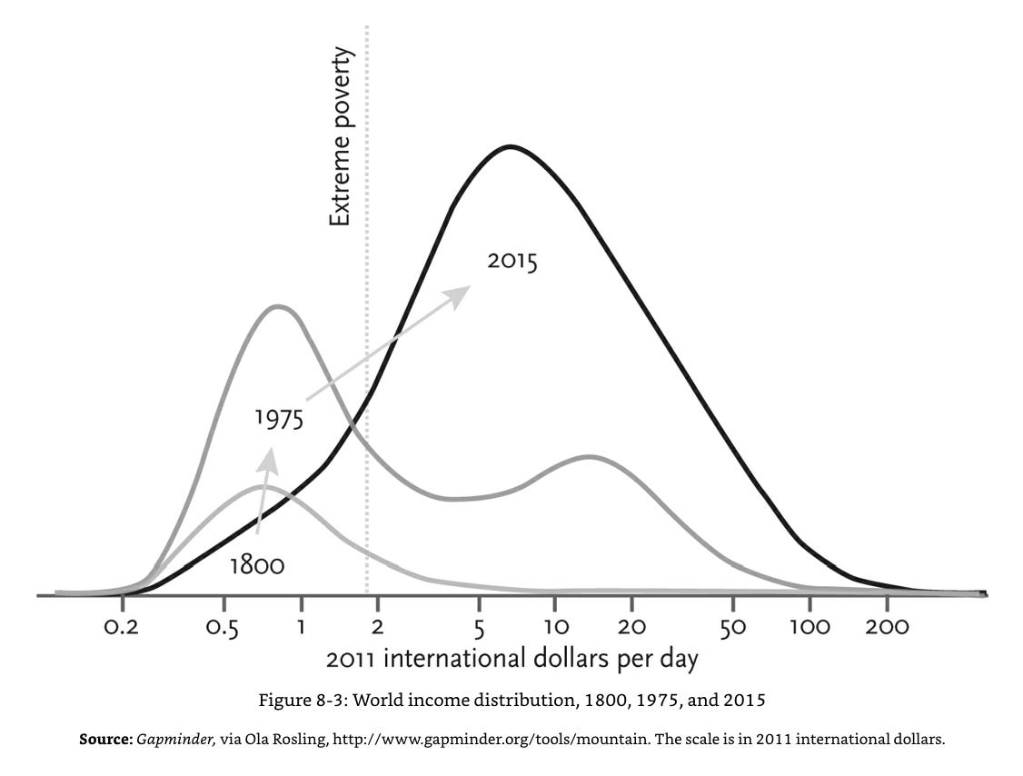
We saw in the previous post the staggering increase in the Gross World Product, but today’s graph does a a better job of visualising how that growth has spread to individual people.
It might need a little explanation - in 1800 the vast majority of people lived in extreme poverty, and the total wealth created each year (the area under the curve) was relatively small. By 1975 the world had split in two humps (this is where we get our terms ‘developed’ and ‘developing’ world), one of which had largely escaped poverty, and one which had not.
But by 2015 the ‘developing’ world had developed to the point that there were no longer two humps, and the number of people above the extreme poverty line was higher than ever.
A bonus take-away from this graph - Hans Rosling advises that thinking of the world in terms of ‘developed’ and ‘developing’ is outmoded, and it is far more accurate to think of the current state of global development in 4 stages: extreme poverty (around a billion people), two ‘middle income’ stages which gradually increase in health, material possessions and security (6 billion), and ‘high income’ (about a billion). This view of the world has been very helpful for me - you can read more about it here, or in Hans Rosling’s book Factfulness.
Source: Enlightenment now, Stephen Pinker